Master matchers
Visual Communication | User Research
YEAR: September - November 2022
TOOLS: Illustrator
ABOUT MASTER MATCHERS
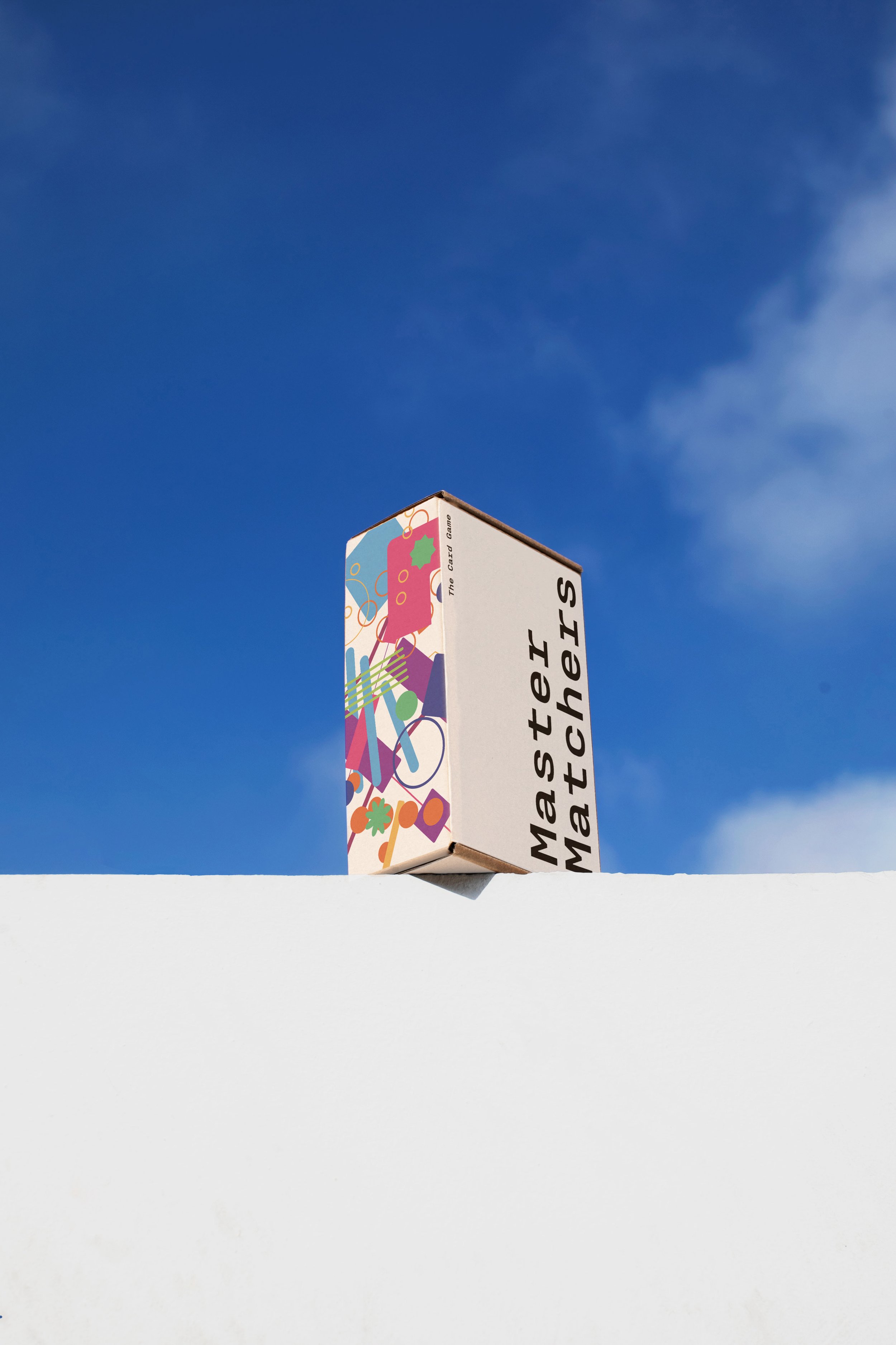
MASTER MATCHERS IS A MEMORY GAME WITH A TWIST
Through this research based project, I explored how a player’s path in a game reflects their approach to everyday situations.The final product is a game whose outcome is dependent on its participant’s personalities; impacting their interaction with the rules.

INTRODUCING MASTER MATCHERS
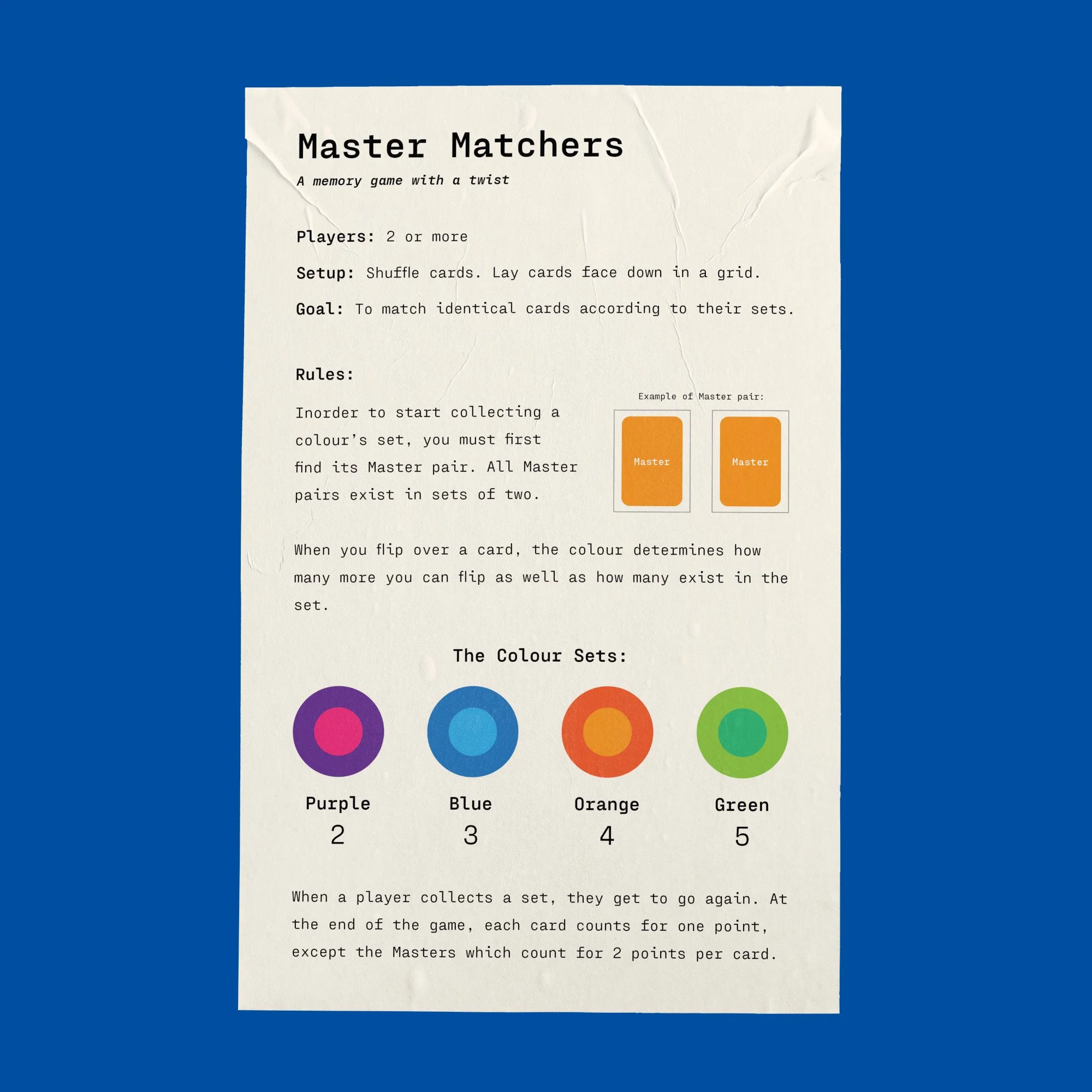
Games are experiences that have been crafted for their players. By adding simple alterations to the classic memory game, Master Matcher's rules are open enough to create different avenues of strategy that players can choose. The context of the game is impacted by how the players engage with challenges. If the group enjoys working together, players can team up or everyone can compete against each other making it harder for one and other to collect cards. Master Matchers is intended to attract players through strategy and the social experience of being with others

USER TESTING
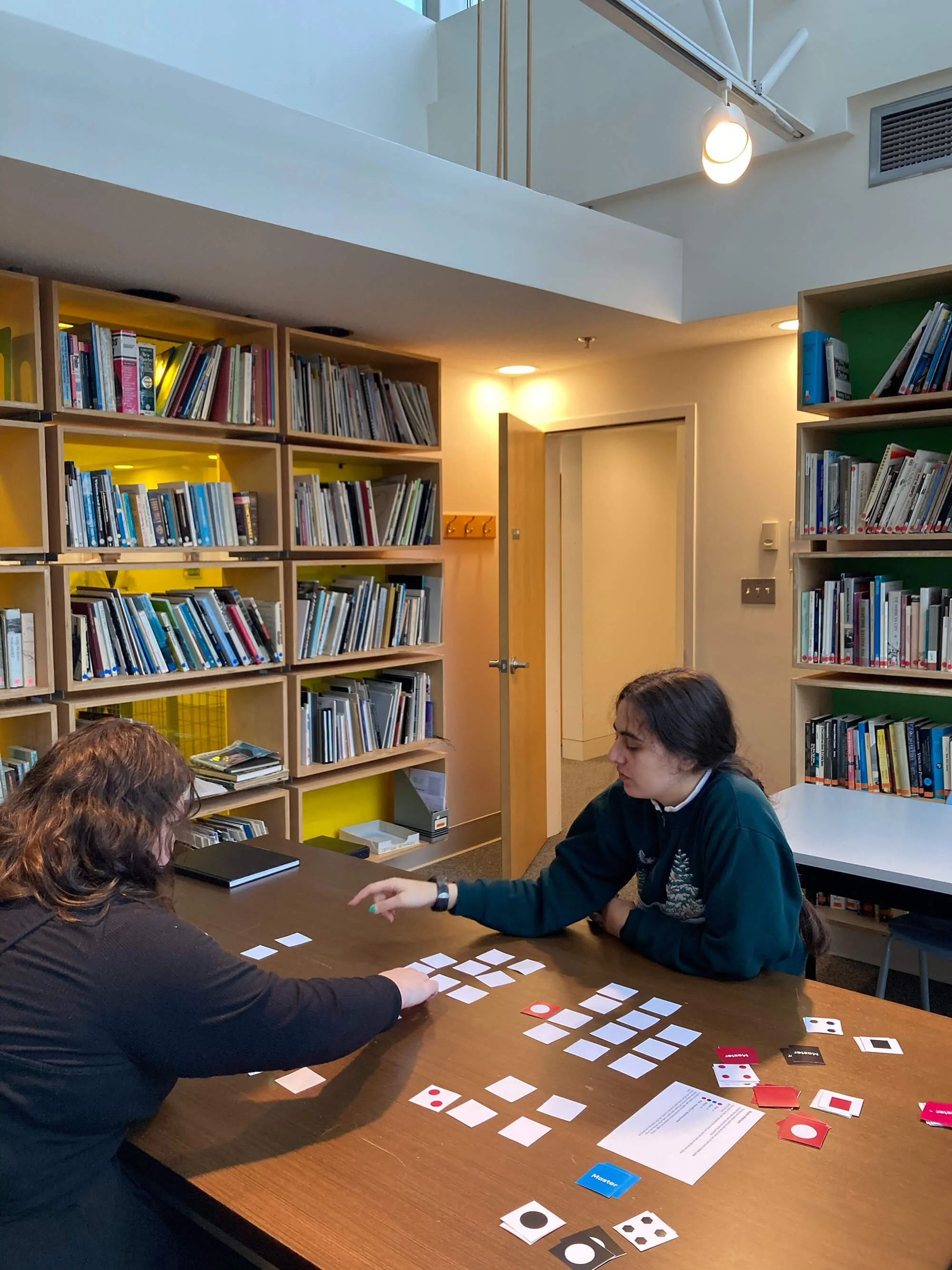
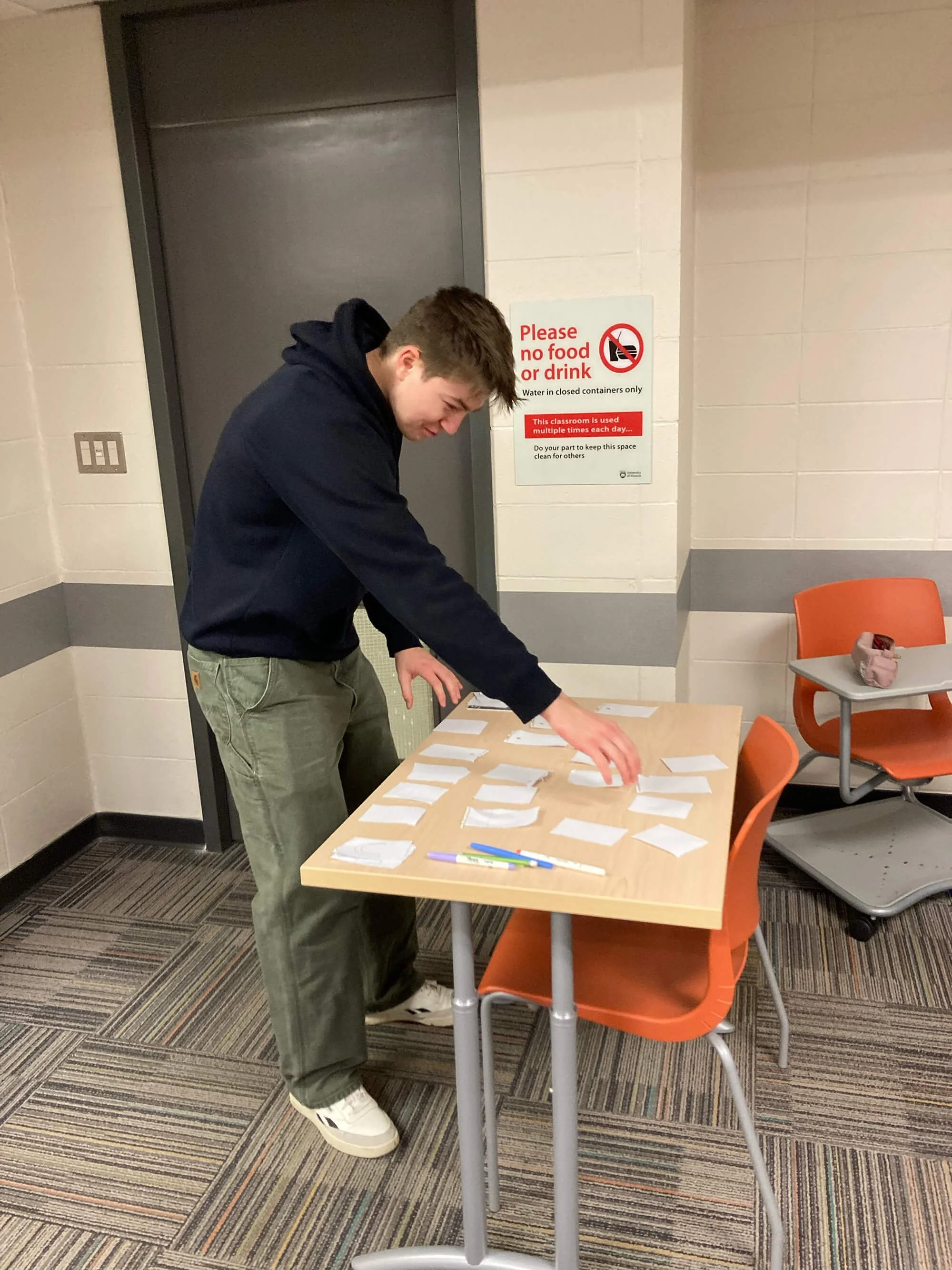
Different iterations of the rules and game deck were tested by different sized groups. Variations included, versions with different numbers of sets, altering the deck size. The size of sets ranged from 2-10 pairs. It was found that having too many larger sets was time consuming and confusing for players to match. However, having some variation of set sizes within the deck was key for adding complexity to the game. Wildcards that allowed players to peek at cards were introduced during testing but they were never that advantageous to the players since they were only useful during certain stages of the game. Allowing players to move cards around was another variation however with smaller decks, it made the game too easy. Some players enjoyed this rule since they worked it into their strategy however it was not included in the final version due to how messy it made the game board.


VISUAL DESIGN
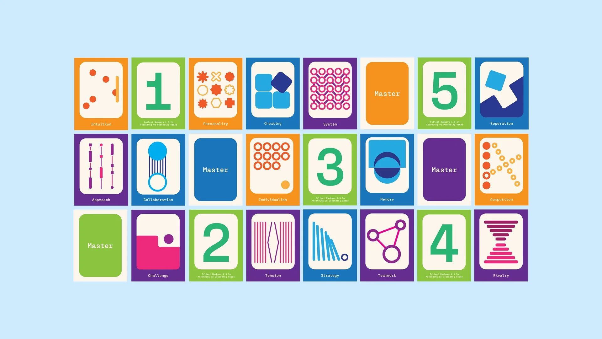
The visual design of the game draws from the different topics that came up during the research process. I designed the cards to be playful and simple, representing the nature of the game. Using a colourful pallet aligns with the concept that play is inclusive and brings people together, regardless of their background. The tone of the game is determined by its players so there’s not just one colour that can represent the game. Having different colours also makes the game easier to play, minimising the risk of the sets being confused. The playful card designs feature geometric abstraction inspired by swiss graphics while making use of semiotics. The indexes leave room for interpretation yet are symbolic of different human characteristics that appeared when players interacted with the game.

